Why I Like Team Canada’s New Winter Olympic Jerseys

Team Canada unveiled its hockey jerseys for the 2014 Winter Olympic Games this week, and it was greeted with such resolute distain from the general populace, I was taken aback. And here I thought such derision heaped upon clothing only existed in the fashion world, during fashion week and reserved for some poor designer’s dull collection.
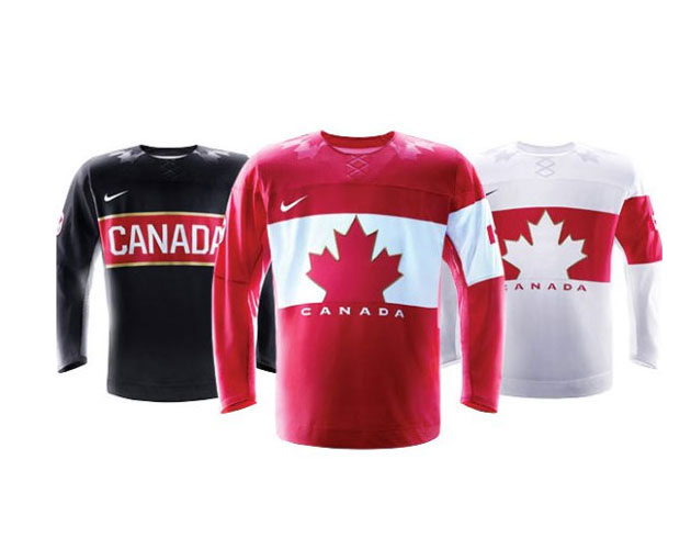
The jerseys in red, white and black were designed by Nike and will be worn by the men’s, women’s and sledge Canadian hockey teams during the Games in Sochi, Russia. The black jersey features large type spelling out Canada while the red and white styles feature a cropped maple logo on a reverse banner. And therein lies one issue that many took to social media to point out: it looks like the Petro-Canada logo.
Yes, it looks similar to the gas station logo, but I must say I liked the graphic simplicity of the design. It’s bold, eye-catching and unabashedly patriotic.
I also loved the retro vibe – a nod to the 1920 and 1972 jerseys; pivotal years in Canadian hockey history. But the Nike design team said it gave it a modern update with fabric technology. These jerseys are super-lightweight and made from recycled plastic bottles.
Since I’ll be the first to admit I don’t know much about the sartorial charms of hockey, I had to take a look back in history to see what our teams wore in the past Games. Not much has changed in terms of colour. Most of it was pretty much red, white and sported a maple leaf logo.
The very first jersey in 1920 sported an unusual mustardy gold and black colour combo. In 1974, it had a dizzying amount of maple leafs and stripes splattered all over.
I’d say 2014 is the most clean and streamlined designed hockey jersey in a while. Just what we need for Team Canada to be on the ice come next year: razor sharp.